Worst Website Design Nominee
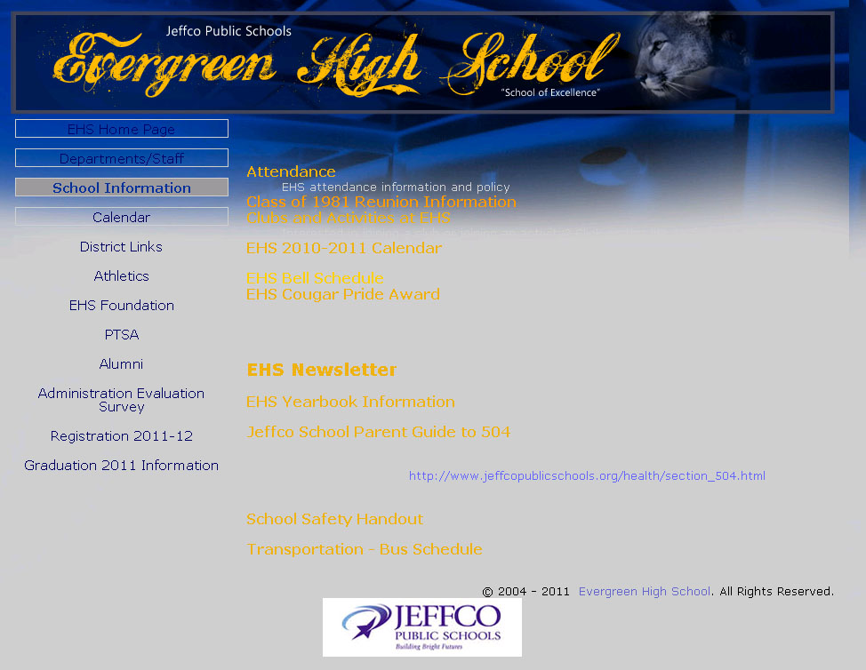
At first glance this website doesn’t look too bad.

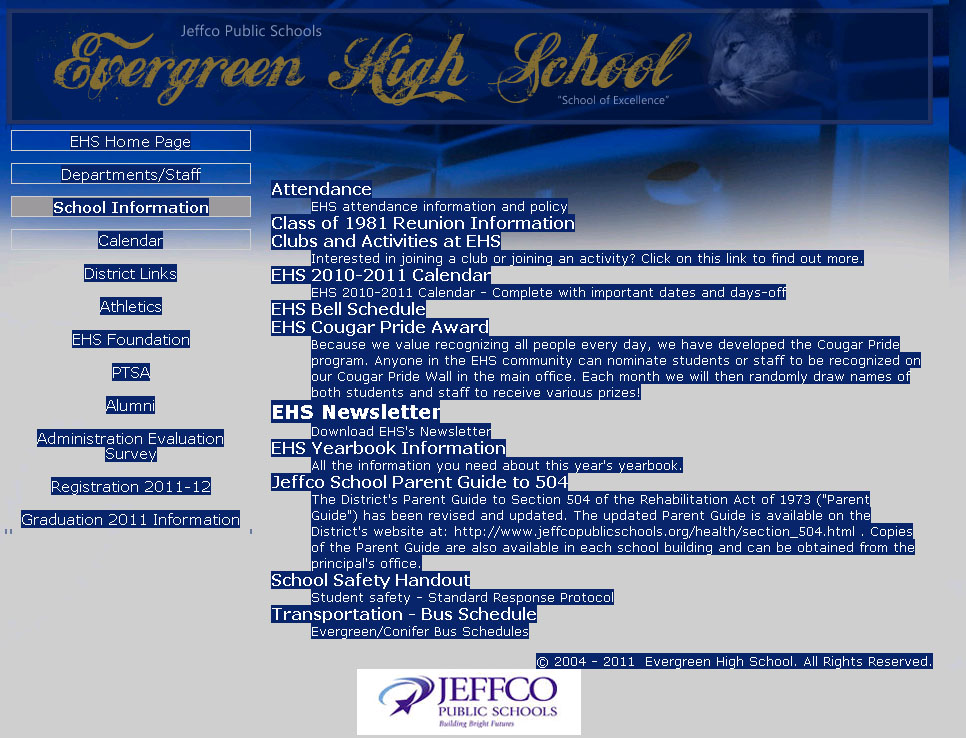
A poor design to be sure, but still somewhat readable. However, something didn’t quite seem right so I did a Ctrl + A to select all and this is what it revealed:

Hilarity and shame, shame, shame. I shall say no more.